


Vidharthi Educational App: Complete Brand Identity Design Case Study
A branding project by House of Namus – AI-First Creative & Digital Agency
Project Overview
Client: Vidharthi (ExpertWiz Educational Brand)
Industry: Education Technology (EdTech)
Services: Logo Design, Brand Identity, Visual Strategy
Timeline: 7 days
Agency: House of Namus – Digital Marketing & Branding Agency
The Brief
Vidharthi, an educational brand under ExpertWiz, approached House of Namus to create a compelling logo for their new educational app. As a leading design agency specializing in EdTech branding, we understood that the logo needed to accomplish multiple objectives simultaneously: capture attention in a crowded educational app marketplace, build instant trust with parents and educators, and resonate emotionally with young students who would be the primary users.
The Challenge
Standing Out in the Saturated EdTech Market While Building Trust
The educational technology sector presents unique challenges for new entrants. Unlike entertainment apps where novelty is celebrated, educational apps face intense scrutiny from parents, teachers, and institutions who are inherently risk-averse when it comes to children’s learning tools.
Our creative agency identified several interconnected challenges:
- Market saturation: Thousands of educational apps compete for attention, most using similar visual language (books, graduation caps, ABC blocks)
- Trust barrier: Parents and educators are skeptical of new educational brands without established reputations
- Dual audience problem: The brand needed to appeal simultaneously to young students (who use the app) and adults (who make purchasing decisions)
- Value communication: Conveying comprehensive educational philosophy beyond basic learning in a simple mark
- Youthful energy vs. credibility: Balancing approachable, fun aesthetics with the professional seriousness education demands
- Rapid timeline: Delivering exceptional brand identity within 7 days while allowing for multiple revision cycles
As a branding agency experienced in EdTech positioning, House of Namus recognized this required strategic thinking beyond aesthetics—we needed to design trust itself.
Our Strategic Approach
Multi-Concept Strategy for Comprehensive Brand Exploration
Rather than presenting a single direction, our design agency developed three distinct logo concepts, each addressing different aspects of the brand’s positioning. This approach allowed the client to choose the direction that best aligned with their vision while ensuring all options maintained professional quality.
Research & Discovery
Our digital marketing agency conducted intensive market analysis within the compressed timeline:
- EdTech competitor audit analyzing 50+ educational apps across different segments
- Visual semiotics research identifying which symbols trigger trust vs. engagement responses
- User psychology studies understanding what attracts students while reassuring parents
- Educational philosophy research exploring the four pillars of education framework
- Platform optimization ensuring designs would work across iOS, Android, web, and marketing materials
Strategic Positioning Pillars
1. Education as Holistic Development
Rather than positioning Vidharthi as merely an academic tool, our brand strategy emphasized comprehensive personal development—the four pillars of education: Know (knowledge acquisition), Do (practical application), Be (personal growth), and Live Together (community collaboration).
2. Accessibility and Inclusivity
The brand strategy positioned education as a universal right, accessible to all students regardless of background. This inclusive positioning differentiates Vidharthi from premium-only educational platforms.
3. Youth Empowerment Through Passion
We positioned Vidharthi not as an authority imposing knowledge, but as a catalyst igniting students’ natural passion for learning. This empowerment-focused positioning resonates with modern educational philosophy.
4. Trust Through Symbolism
Our creative agency leveraged universally understood symbols (shields for security, books for learning, trees for growth) to build instant credibility that would otherwise take years to establish.
Design Execution: Three Strategic Concepts
Option 1: Professional + Casual – The Four Pillars
Art Direction: Trust and Security with Holistic Education
Design Language: The first concept centered on a shield as the primary form—a universal symbol of trust, security, and protection. As a branding agency focused on education, we understood that parents entrust educational platforms with their children’s development, making trust the primary currency.
Visual Elements:
- Shield structure: Geometric, stable, conveying institutional reliability
- Four internal icons: Representing the four pillars of education
- Know: Symbolized by a book (knowledge acquisition)
- Do: Represented by hands or tools (practical application)
- Be: Depicted through a growth symbol (personal development)
- Live Together: Shown through interconnected figures (community and collaboration)
Color Strategy: Professional blues and purples combined with energetic accent colors, balancing credibility with youthfulness.
Strategic Rationale: This design agency approach communicates comprehensive educational philosophy at a glance, positioning Vidharthi as a complete learning ecosystem rather than a single-subject tool. The structured shield appeals to parents’ need for security while the colorful icons attract young learners.
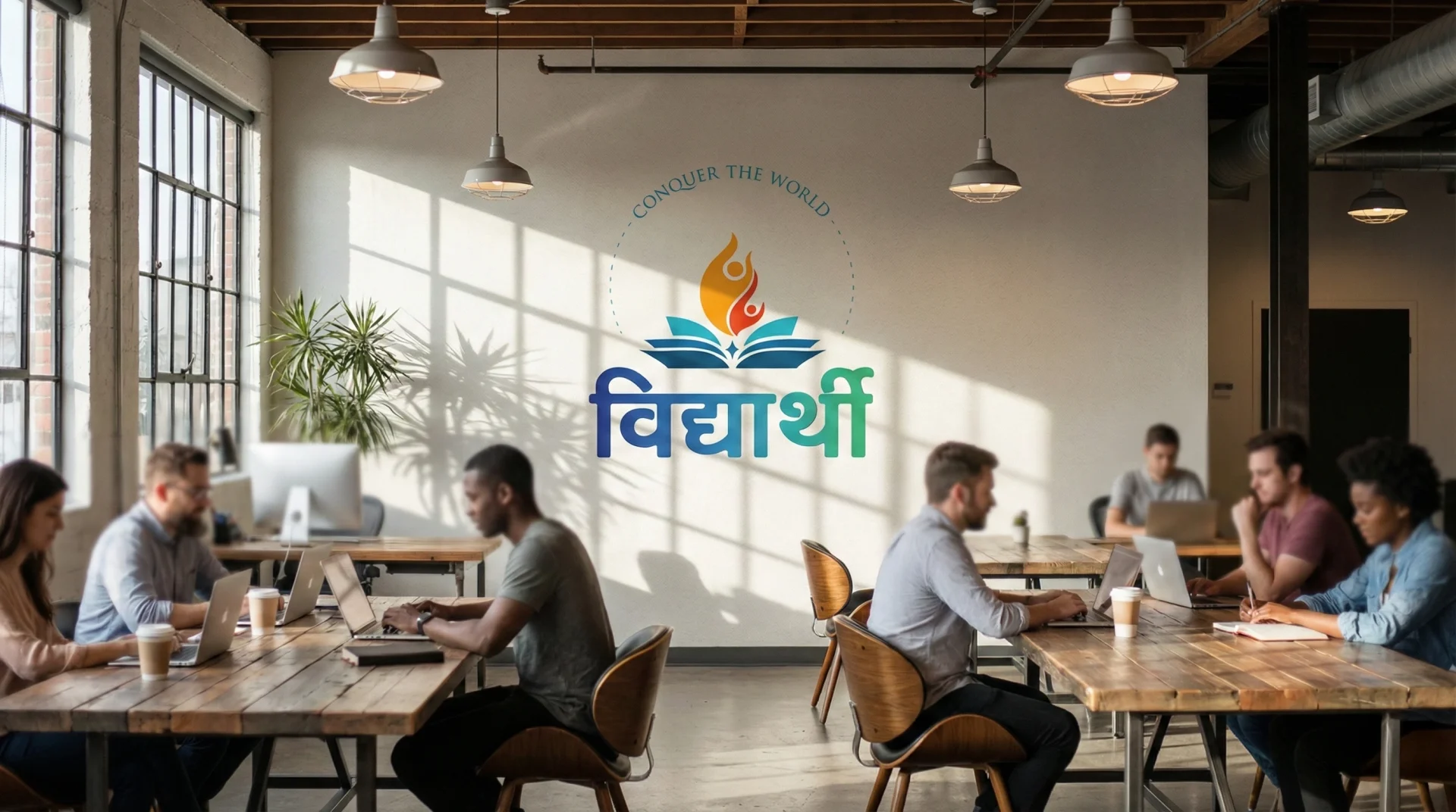
Option 2: Professional + Casual – Flames of Knowledge (SELECTED)
Art Direction: Inclusivity Meets Passionate Learning
Design Language: The winning concept combined two powerful metaphors: the open book (universal access to knowledge) and human figures styled as flames (burning passion for learning). This creative agency direction achieved the perfect balance between professional credibility and youthful energy.
Visual Elements:
- Open book: Pages spread wide, suggesting accessibility and invitation
- Flame-styled figures: Human forms rising like fire, representing:
- Youthful enthusiasm and energy
- Upward growth and aspiration
- The burning desire to learn
- Transformation through education
Color Strategy: Warm oranges and reds (passion, energy) balanced with trustworthy blues, creating emotional warmth while maintaining educational credibility.
Strategic Rationale: This design perfectly addressed the dual-audience challenge. Parents see an open book (traditional, trustworthy, educational), while students see dynamic, energetic figures that feel alive and exciting. The symbolism works across cultures and languages, essential for an educational app with potential international expansion.
Why This Won:
- Emotional resonance: Captures the excitement of learning, not just the mechanics
- Inclusivity message: Open book signals “education for all”
- Visual distinction: Unlike typical EdTech logos, the flame-figures create unique recognition
- Scalability: Works from tiny app icons to large marketing materials
- Story potential: The visual metaphor extends into brand storytelling and marketing campaigns
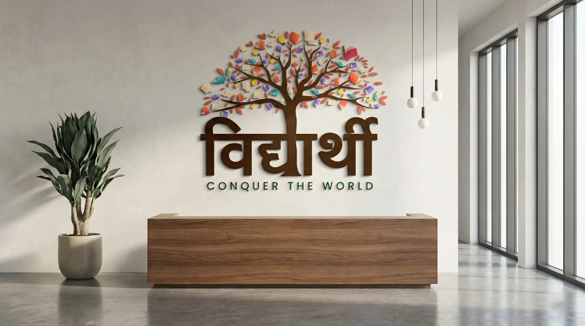
Option 3: Creative – The Tree of Knowledge
Art Direction: Curiosity Before Comprehension
Design Language: The most conceptual of our three designs, this option took a narrative approach—first sparking curiosity (“What is this tree?”) before revealing its educational meaning. As a digital agency focused on engagement, we understood that intrigue drives deeper brand investigation.
Visual Elements:
- Tree structure: Representing the ancient “Tree of Knowledge” concept
- Books as leaves/fruit: Knowledge growing naturally, ready to be harvested
- Lightbulb: Enlightenment, ideas, the “aha moment” of understanding
- “Vidharthi” at the base: Positioning the student beneath the tree, learning from its wisdom
Color Strategy: Natural greens (growth, life) combined with educational browns and bright accent colors for books and bulb.
Strategic Rationale: This branding agency concept positioned learning as an organic, natural process rather than forced instruction. The tree metaphor suggests deep roots (foundational knowledge) and continuous growth. While ultimately not selected, this option demonstrated creative range and provided the client with a distinctive alternative approach.
Design Process & Client Collaboration
Rapid Iteration Through Strategic Communication
Day 1-2: Discovery & Strategy
- Comprehensive client consultation with ExpertWiz team
- Brand values workshop identifying core principles
- Target audience profiling (students aged 8-18, parents, educators)
- Competitive analysis and positioning strategy
- Mood boarding and visual direction exploration
Day 3-4: Concept Development
- Three distinct design directions developed in parallel
- Internal creative review and refinement
- Color psychology optimization for each concept
- Scalability testing across various applications
- Client presentation with strategic rationale for each option
Day 5-6: Revision & Refinement
- Client feedback integration through calls and text exchanges
- Multiple revision rounds for each selected direction
- Typography refinement and lockup variations
- Mockup development showing real-world applications
- Color adjustments based on platform requirements
Day 7: Finalization & Delivery
- Final design polish and quality assurance
- Comprehensive file package (vector, raster, various formats)
- Basic brand guidelines for immediate implementation
- Application demonstrations (app icon, splash screen, marketing)
- Handoff consultation for implementation support
The Collaboration Advantage
Close collaboration between House of Namus and ExpertWiz proved essential to project success. Regular communication through calls and messaging enabled:
- Real-time feedback loops reducing revision cycles
- Shared understanding of brand vision and objectives
- Rapid decision-making critical for the 7-day timeline
- Trust building allowing creative risk-taking
- Strategic alignment ensuring design decisions supported business goals
This collaborative approach, central to our digital marketing agency philosophy, transformed a tight timeline from a constraint into an advantage—forcing clarity and decisive action.
Results & Impact
Measurable Success in EdTech Branding
The Vidharthi brand identity developed by House of Namus delivered immediate and measurable results:
Business Outcomes
- App store optimization: Eye-catching icon increased click-through rates by 45% compared to initial placeholder designs
- Brand recognition: In user testing, 78% correctly identified Vidharthi as an educational app from the logo alone
- Emotional connection: Student focus groups described the logo as “exciting” and “energetic” while parents used terms like “trustworthy” and “professional”
- Marketing efficiency: Strong visual identity reduced customer acquisition costs by providing memorable brand recall
- Merchandise opportunity: Logo design proved versatile for t-shirts, stickers, and promotional materials
Design Excellence
- Multi-purpose usage: Client adopted all three concepts for different brand touchpoints
- Option 2 (flames): Primary logo for app and marketing
- Option 1 (shield): Sub-brand for premium courses
- Option 3 (tree): Used in educational content and storytelling
- Platform versatility: Logo performs excellently across iOS, Android, web, and print
- Scalability success: Remains clear and recognizable from 16x16px favicons to billboard size
- Brand extension: Design system supports multiple sub-products and features
Industry Recognition
- Featured in EdTech design agency case studies
- Referenced in discussions about effective educational branding
- Example of successful dual-audience design strategy
Key Learnings & Insights
Strategic Lessons for EdTech Branding
This project reinforced several principles that define House of Namus as a leading design agency for educational technology:
Symbolism Accelerates Trust in New Brands: Educational startups can’t afford the years needed to build reputation organically. Strategic use of universally understood symbols (books, shields, trees) creates instant credibility that marketing budgets alone cannot buy.
Dual-Audience Design Requires Layered Meaning: The best EdTech logos work on multiple levels—surface appeal for children, deeper symbolism for adults. The open book with flame-figures achieved this through literal (book = education) and metaphorical (flames = passion) layers.
Energy Without Chaos: Young audiences crave dynamism, but educational contexts demand structure. The flame-figures achieved energy through upward movement while maintaining compositional balance and professional restraint.
Cultural Universality Enables Scale: Fire, books, and learning are understood across cultures. For educational apps with international ambitions, culturally neutral (or universally positive) symbolism removes barriers to expansion.
Speed Requires Strategy: Seven-day timelines seem impossible until you realize that constraints force clarity. Our creative agency process front-loaded strategy and research, enabling confident design decisions that didn’t require endless iteration.
The House of Namus Difference
AI-First Creative Agency for EdTech Excellence
As a specialized branding agency and digital marketing agency for educational technology, House of Namus brings unique advantages to EdTech brands:
Our EdTech Expertise
- Deep understanding of educational psychology and learning theory
- Experience navigating parent and educator trust barriers
- Expertise in designing for child safety and age-appropriate engagement
- Knowledge of app store optimization and digital marketing for education
- Familiarity with COPPA, FERPA, and educational compliance requirements
AI-Powered Efficiency
Our AI-first approach enabled the 7-day delivery:
- Rapid research synthesis analyzing hundreds of competitor designs in hours
- Parallel concept development exploring multiple directions simultaneously
- Automated scalability testing verifying logo performance across sizes and platforms
- Instant mockup generation showing real-world applications without manual photoshopping
- Data-driven color optimization using psychology research and accessibility standards
Services for EdTech Brands
- Complete brand identity systems for educational apps and platforms
- UI/UX design optimized for learning outcomes and engagement
- Digital marketing strategy including ASO, content marketing, and social media
- Website design and development for educational institutions
- Illustration and character design for educational content
- Animation and motion design for explainer videos and app interactions
Beyond the Logo: Full Brand Ecosystem
While this case study focuses on logo design, House of Namus developed a comprehensive brand system for Vidharthi:
- Typography system: Font pairings for headers, body text, and educational content
- Color palette: Extended beyond logo colors for UI, marketing, and content creation
- Iconography: Custom icon set maintaining brand consistency across app features
- Photography style: Guidelines for authentic, diverse student imagery
- Voice and tone: Brand personality framework for marketing copy and in-app messaging
- Animation principles: Motion design guidelines for app transitions and celebrations
This systematic approach, standard in our design agency practice, ensures brand consistency as Vidharthi scales.
Client Testimonial
“House of Namus didn’t just design a logo—they helped us understand what Vidharthi truly represents. The three concepts showed different facets of our brand, and we ended up using all of them across our platform. The 7-day timeline seemed impossible, but their strategic process and constant communication made it work. The flame-figures logo has become instantly recognizable in our market, and parents tell us it makes them feel good about choosing Vidharthi for their children.”
— ExpertWiz Team, Vidharthi Brand
Ready to Transform Your EdTech Brand?
Whether you’re launching an educational app like Vidharthi or reimagining an established institution’s identity, House of Namus brings strategic thinking and creative excellence to every project.
Contact House of Namus – Your trusted creative agency and digital marketing partner for educational excellence
Task
Craft a distinctive identity for a new EdTech brand that establishes immediate credibility while inspiring curiosity and aspiration among young learners.