


Spes Manning Solutions LLP: Complete Brand Identity Design Case Study
A branding project by House of Namus – AI-First Creative & Digital Agency
Project Overview
Client: Spes Manning Solutions LLP
Industry: HR Consultancy & Talent Acquisition
Services: Logo Design, Complete Brand Identity, Visual Strategy
Timeline: 3 weeks
Agency: House of Namus – Digital Marketing & Branding Agency
The Brief
SPES approached House of Namus to design a complete brand identity system for their HR consultancy focused primarily on fresher recruitment. With nearly 90% of their audience being first-time job seekers, the brand needed to communicate trust, hope, and opportunity—without losing credibility with corporate hiring partners.
As a branding agency experienced in people-centric industries, we understood that SPES was not merely filling vacancies. The brand was shaping first careers, first confidence boosts, and first professional identities. The visual identity had to reflect that responsibility.
The Challenge
Designing Trust for Freshers While Maintaining Corporate Credibility
The HR consultancy space is crowded with brands that look transactional, rigid, and impersonal. For experienced professionals, that may be acceptable. For freshers, it creates distance and anxiety.
Our creative agency identified several key challenges:
-
Emotionally vulnerable audience: Freshers associate job search with uncertainty, fear, and hope
-
Corporate perception risk: The brand still needed to feel reliable and professional to employers
-
Overused HR symbolism: Abstract arrows, generic people icons, and sterile typography dominate the space
-
Dual-sided branding: Appealing simultaneously to job seekers and recruiters
-
Meaning over aesthetics: The identity needed to say something, not just look good
-
Scalability: The system had to work across digital, print, and physical environments
For SPES, branding wasn’t about looking modern—it was about reassurance.
Our Strategic Approach
Narrative-Driven Branding with Human Symbolism
Rather than designing a logo in isolation, our design agency approached SPES as a story system. The brand needed to visually explain what SPES does in seconds—especially to a fresher encountering it for the first time.
Research & Discovery
Our digital marketing agency conducted focused discovery across the HR and recruitment landscape:
-
HR consultancy competitor audit across fresher-focused and enterprise hiring firms
-
User psychology mapping of fresher emotions during early job search stages
-
Symbolism research around hope, guidance, employment, and trust
-
Brand semiotics study on how humans perceive support vs authority
-
Application testing across stationery, ID cards, reports, and physical branding
Strategic Positioning Pillars
1. Hope as a Brand Asset
SPES positions employment not as pressure, but as possibility. Hope became a core visual driver.
2. Jobs as a Bridge, Not a Transaction
The brand reframes hiring as a connection between aspiration and opportunity.
3. Human-Centered Professionalism
SPES needed warmth without informality—professional, but emotionally accessible.
4. Symbolism That Explains the Brand
The logo had to communicate meaning even without text or explanation.
Design Execution: Logo Exploration
Multi-Option Logo Strategy
Instead of pushing a single solution, our branding agency developed six logo concepts, each exploring different symbolic interpretations of SPES—from abstract corporate forms to narrative-driven marks.
This allowed SPES to evaluate the brand not just visually, but philosophically.
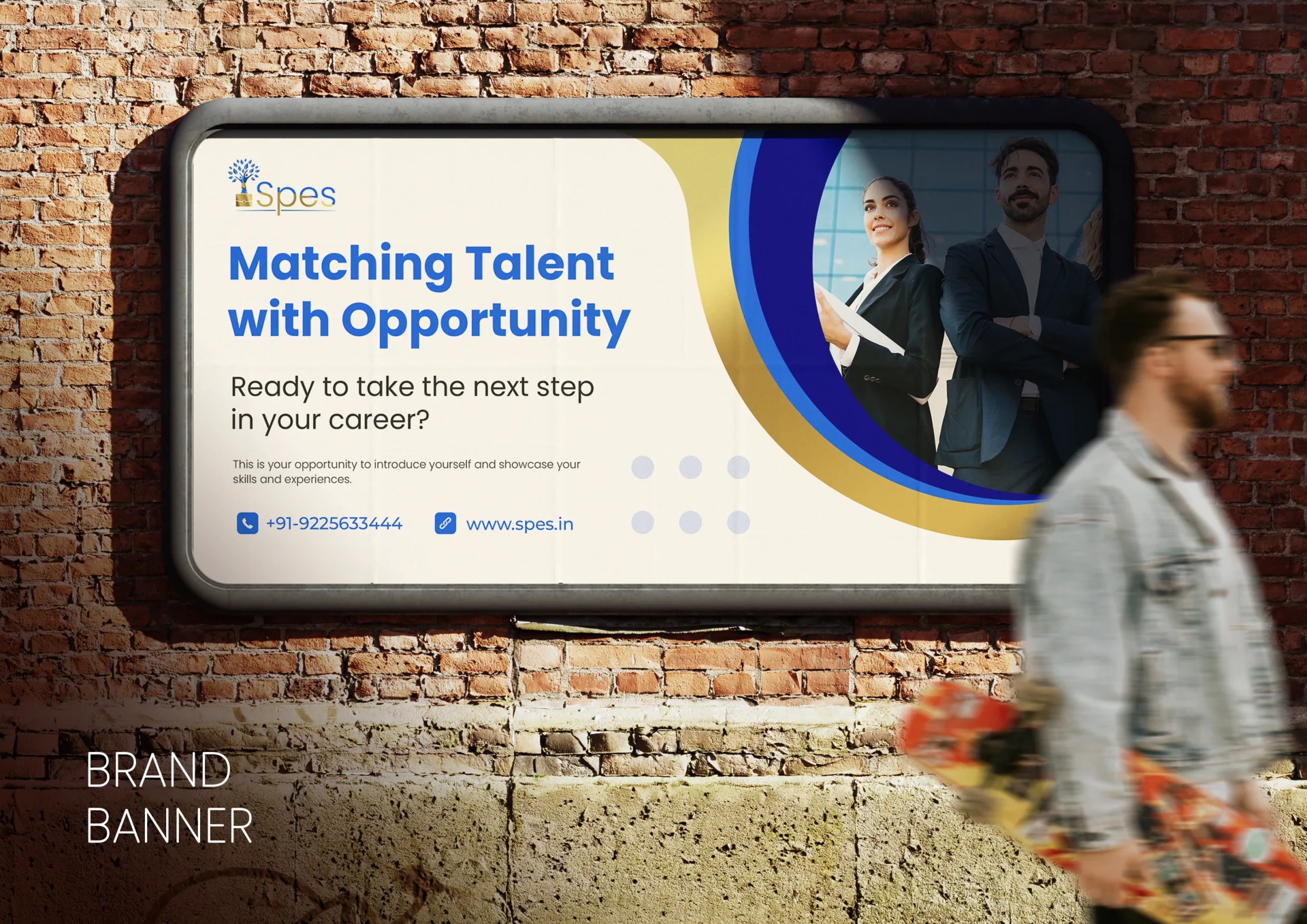
Final Logo: Meaning-Led Design (SELECTED)
Art Direction: Business Professional with Emotional Depth
Design Language
The selected logo integrates multiple symbolic elements into a single, cohesive mark—each reinforcing SPES’s mission.
Visual Elements Breakdown
-
Tree & Leaves: Growth, continuity, and hope
-
Briefcase: Employment, career, professionalism
-
Hand: Support, guidance, trust
-
Bridge Formation: Connecting hope to job opportunity
-
Two Human Figures: Cheerfulness, inclusivity, and human connection
Rather than abstract minimalism, the logo functions as a visual explanation of SPES itself.
Color Strategy
-
Corporate Blue: Trust, reliability, professionalism
-
Golden Accents: Hope, value, and premium perception
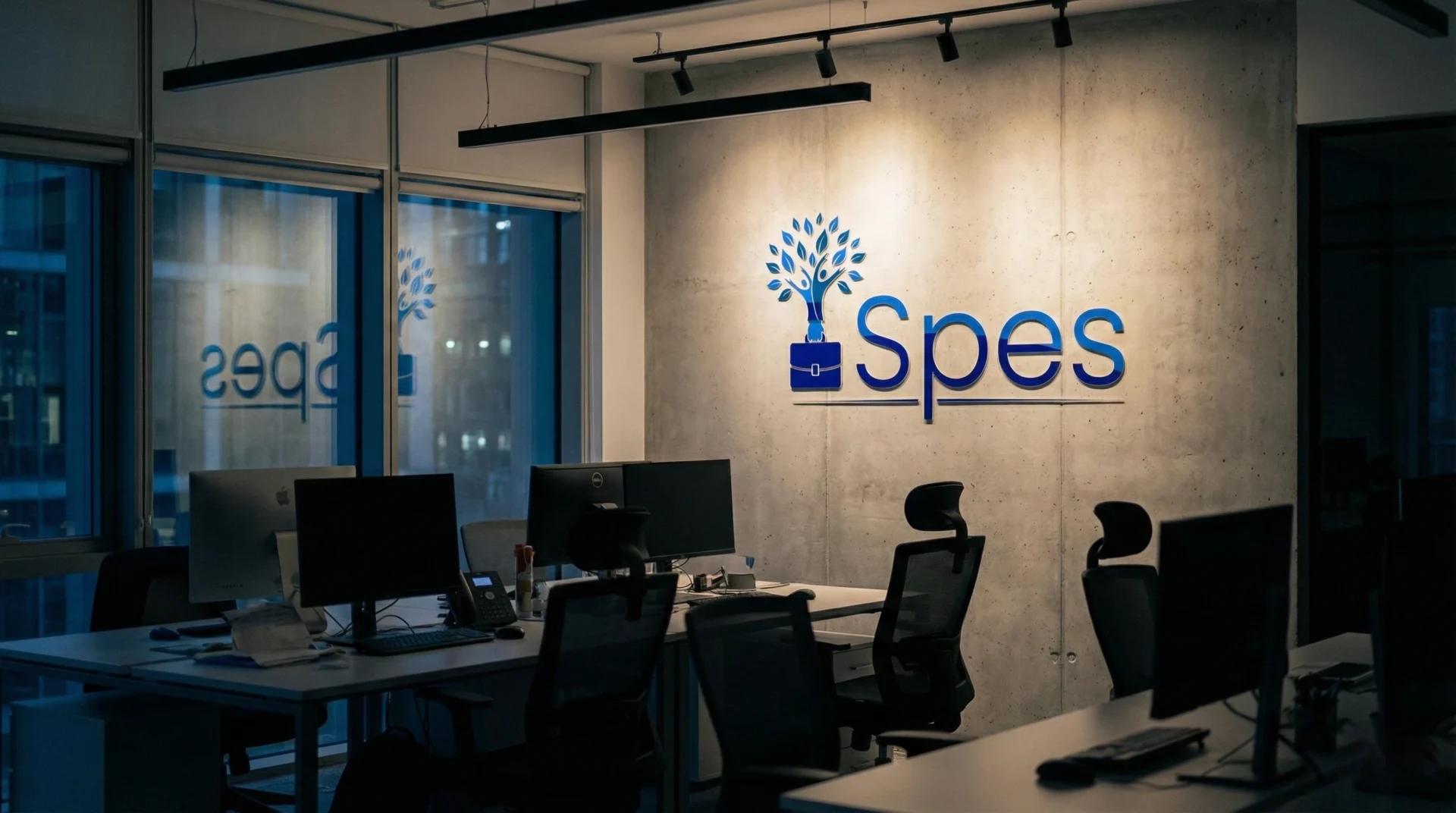
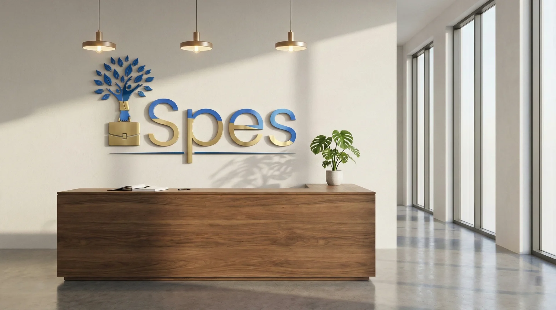
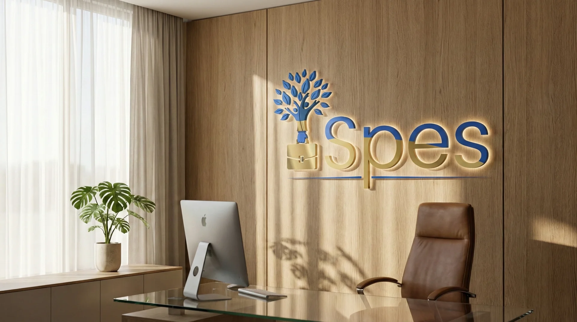
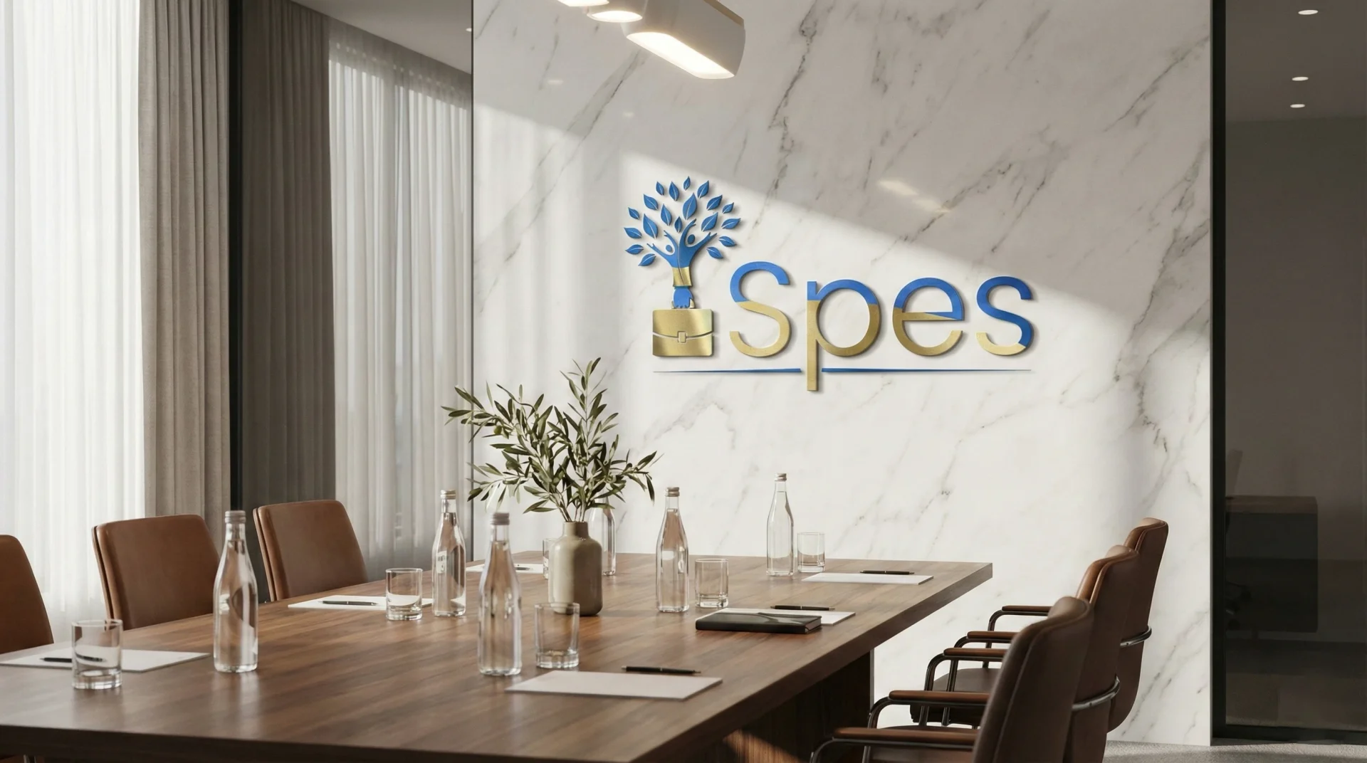
Logo Variations
-
Primary Gold-Toned Version: Premium communication and leadership assets
-
Corporate Blue Version: Daily operational and digital usage
-
Grayscale / Dark Background Version: Maximum flexibility across environments
Strict usage, clearspace, and color rules were defined to maintain consistency across all applications.
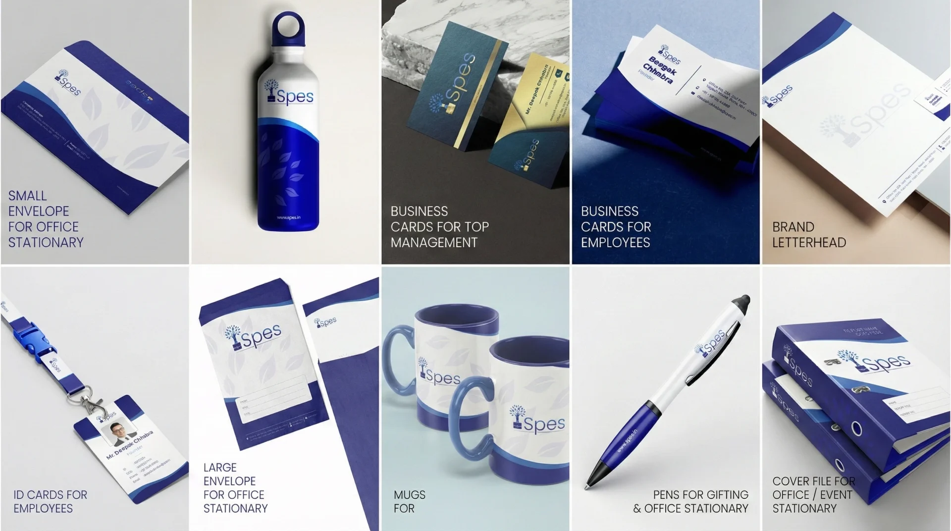
Complete Brand Identity System
Beyond the logo, House of Namus designed a full brand ecosystem to ensure SPES remains consistent at every touchpoint.
Brand Collaterals Designed
-
Business Cards (Management & Employees)
-
Letterheads & Envelopes
-
Employee ID Cards
-
Report Covers
-
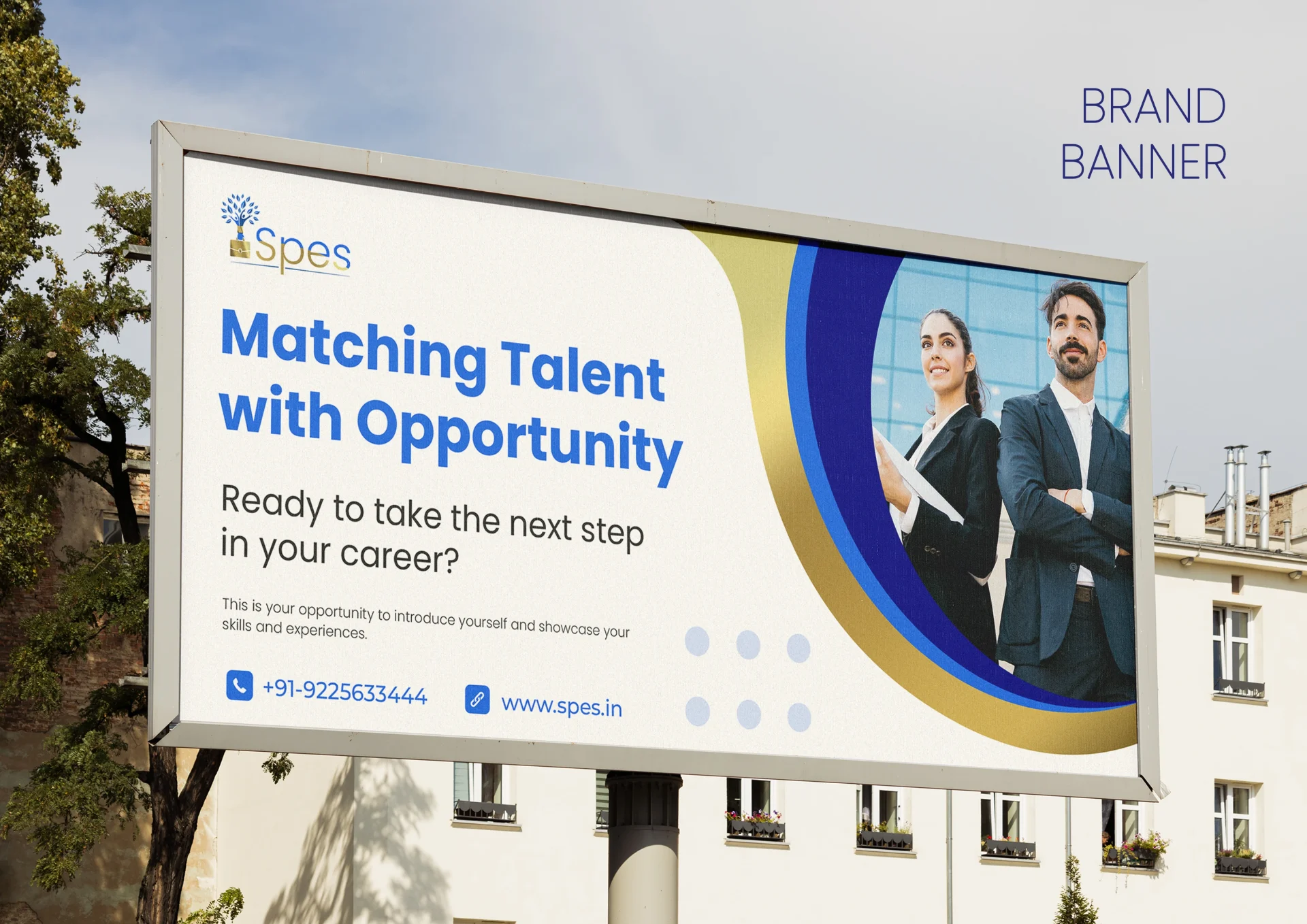
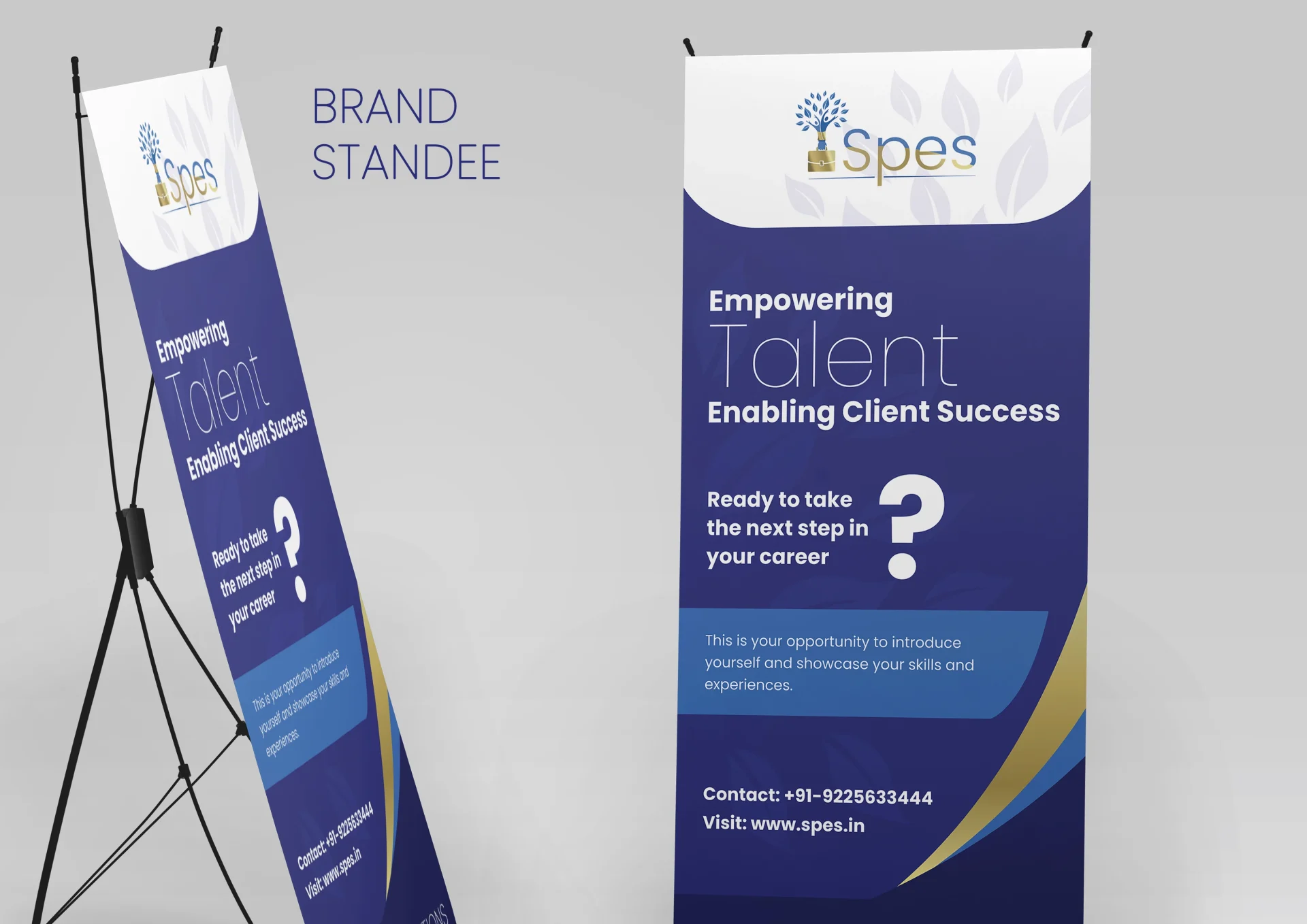
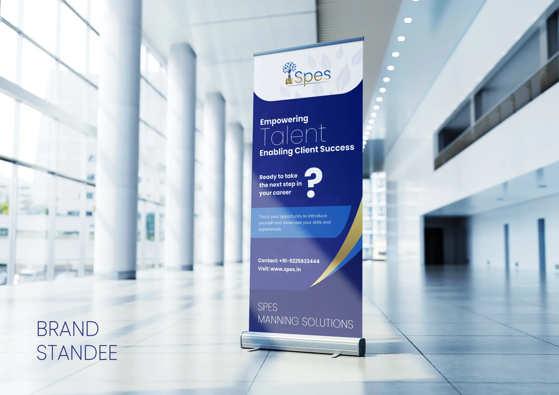
Banners & Standee Designs
-
Bottles, Mugs, Pens
-
Internal & External Branding Assets
Each asset follows the same visual hierarchy, color discipline, and symbolic language.
Design Process & Client Collaboration
Structured Execution with Continuous Alignment
Week 1: Discovery & Strategy
-
Brand discovery workshops
-
Audience profiling (freshers & recruiters)
-
Competitive positioning analysis
-
Concept direction exploration
Week 2: Design Development
-
Six logo concepts developed
-
Iterative feedback loops
-
Symbol refinement and simplification
-
Typography and color system finalization
Week 3: Brand System Build
-
Logo lockups & variations
-
Brand guidelines creation
-
Full stationery & collateral design
-
Final delivery and handover
The Collaboration Advantage
Close collaboration with the SPES team enabled:
-
Faster decision-making
-
Clear alignment on brand philosophy
-
Reduced revision fatigue
-
Strategic clarity across all outputs
Results & Impact
A Human-Centered Identity in a Transactional Industry
Brand Outcomes
-
Clear emotional positioning for freshers
-
Strong professional perception among recruiters
-
Immediate visual differentiation from typical HR consultancies
-
Consistent identity across physical and digital touchpoints
Design Excellence
-
Symbol-driven logo with layered meaning
-
Highly scalable across formats
-
Balanced emotional warmth and corporate discipline
-
Long-term brand adaptability
Key Learnings & Insights
Strategic Lessons from HR & Recruitment Branding
Hope Is a Designable Asset
In people-first industries, emotional reassurance matters as much as competence.
Freshers Need Clarity, Not Complexity
Symbolism works best when it explains, not decorates.
Professional Doesn’t Mean Cold
Human-centered branding can coexist with corporate credibility.
Systems Matter More Than Logos
A strong logo fails without a disciplined identity system supporting it.
The House of Namus Difference
AI-First Creative Agency for People-Centric Brands
As a branding agency and digital marketing agency working across education, HR, and talent ecosystems, House of Namus brings:
Our Expertise
-
Deep understanding of user psychology
-
Experience designing for emotionally sensitive audiences
-
Strategic brand storytelling through symbolism
-
Scalable identity systems for growing organizations
AI-Powered Efficiency
-
Accelerated research synthesis
-
Parallel concept exploration
-
Rapid mockup generation
-
Consistency checks across applications
Beyond the Logo: Full Brand Ecosystem
For SPES, House of Namus delivered more than visuals:
-
Typography system for clarity and hierarchy
-
Color discipline for brand recognition
-
Stationery & asset frameworks
-
Usage guidelines ensuring long-term consistency
This ensures SPES’s brand remains coherent as the organization scales.
Ready to Build a Brand That Connects?
Whether you’re an HR consultancy, startup, or institution shaping careers, House of Namus designs brands that communicate meaning, not noise.
Contact House of Namus – Your trusted creative agency and digital marketing partner for strategic brand building.
Task
Humanizing a traditionally transactional HR consultancy space without diluting professionalism, trust, or enterprise-level authority.