


AAMRIT Food Startup: Complete Brand Identity Design Case Study
A branding project by House of Namus – AI-First Creative & Digital Agency
Project Overview
Client: AAMRIT Food Startup
Industry: Food & Beverage
Services: Brand Identity Design, Logo Design, Visual Identity System
Timeline: 4 weeks
Agency: House of Namus – Digital Marketing & Branding Agency
The Brief
AAMRIT, an emerging food startup, approached House of Namus, a leading branding agency specializing in AI-powered design solutions, to create a brand identity that would establish immediate trust and authenticity in the competitive food market. As a digital marketing agency with deep expertise in brand strategy, we understood that for food businesses, visual credibility isn’t just aesthetic—it’s essential for consumer confidence and market success.
The Challenge
Building Trust for an Unknown Food Brand in a Saturated Market
When AAMRIT came to our creative agency, they faced the classic startup dilemma: how do you convince consumers to trust a brand they’ve never heard of, especially when it comes to something as personal as food?
The food industry is uniquely challenging for new entrants. Unlike tech or fashion startups where innovation is celebrated, food consumers are inherently conservative—they trust established brands and are skeptical of newcomers. Our design agency needed to solve several interconnected problems:
- Zero brand recognition in a market dominated by legacy players
- Cultural authenticity concerns – how to feel genuinely Indian, not manufactured
- Modern vs. traditional tension – appealing to young urban consumers while honoring cultural values
- Competitive differentiation in an oversaturated visual landscape where most food brands look identical
- Multi-platform scalability ensuring the identity works from packaging to digital marketing campaigns
As a digital agency with expertise in both brand psychology and contemporary design trends, House of Namus recognized this required more than aesthetic solutions—it demanded strategic thinking.
Our Strategic Approach
Heritage-Meets-Modern Brand Positioning
Our branding agency developed a positioning strategy that leveraged cultural symbolism as the primary trust-building mechanism. Rather than following predictable food startup patterns (rustic typography, farm imagery, kraft paper aesthetics), we crafted a brand strategy that was distinctly Indian yet unmistakably contemporary.
Research & Discovery
Our design agency conducted comprehensive market analysis:
- Competitor audit of 30+ Indian food brands across traditional and modern categories
- Consumer perception studies identifying trust triggers in food branding
- Cultural symbolism research exploring Indian iconography that communicates purity and authenticity
- Digital-first considerations ensuring the brand identity would excel in e-commerce and social media marketing environments
Strategic Pillars
1. Cultural Authenticity as Competitive Advantage
We positioned the tulsi (holy basil) leaf as the cornerstone of brand credibility. In Indian culture, tulsi represents purity, health, and divine protection. By incorporating this universally recognized symbol, our creative agency gave AAMRIT instant cultural legitimacy that money can’t buy and competitors can’t easily replicate.
2. Abstract Modernism Meets Traditional Roots
The brand strategy balanced heritage with innovation. The Devanagari letterform ‘आ’ (Aa) serves dual functions: establishing authentic Indian identity while creating a modern, abstract mark that feels fresh to younger, design-conscious consumers.
3. Color Psychology for Trust & Appetite
Our digital marketing agency chose a bold red and blue palette strategically:
- Red: Vitality, appetite stimulation, warmth, and the richness of Indian culinary traditions
- Blue: Trust, reliability, cleanliness—critical for food safety perception
- The interlocking color system creates visual tension and memorability in crowded retail environments
4. Digital-First Scalability
Knowing AAMRIT would compete primarily through e-commerce and social media marketing, we ensured the identity maintained impact at small sizes on mobile screens while scaling beautifully for large-format applications.
Design Execution
Traditional Symbolism Through Contemporary Design Language
Art Direction Philosophy
House of Namus, as an AI-first creative agency, employed both human intuition and AI-assisted design exploration to develop multiple conceptual directions. Our final art direction achieved what we call “elevated tradition”—respectful of cultural heritage without feeling dated, modern without feeling sterile.
Visual Identity System
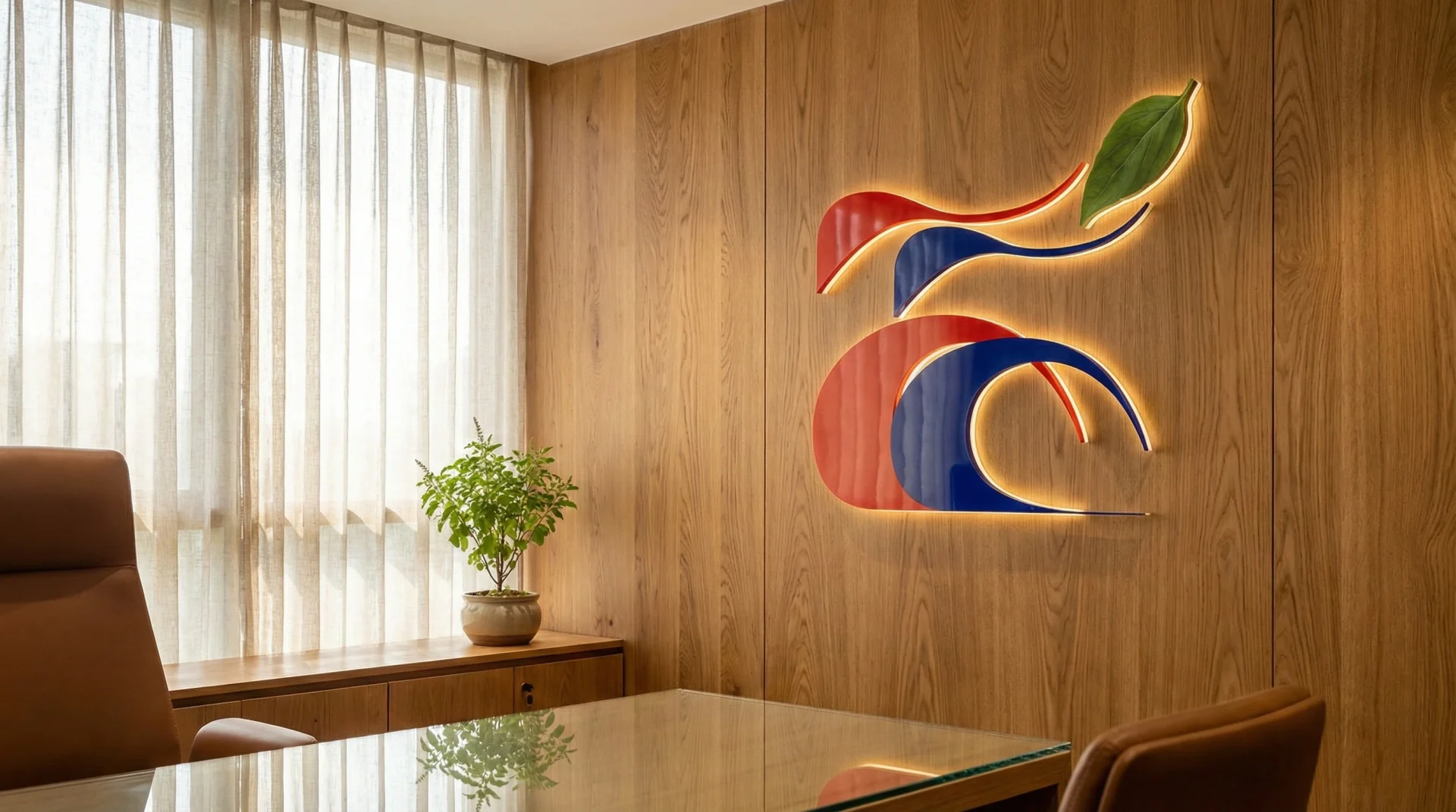
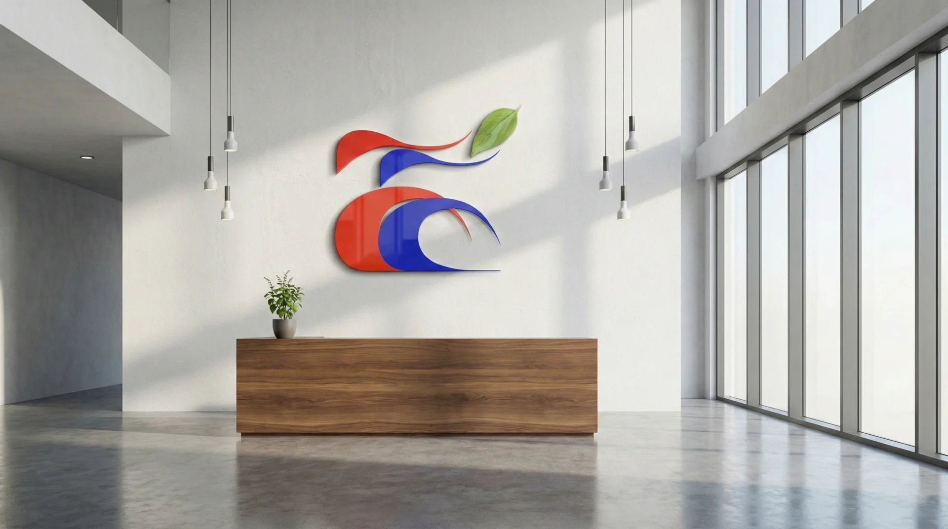
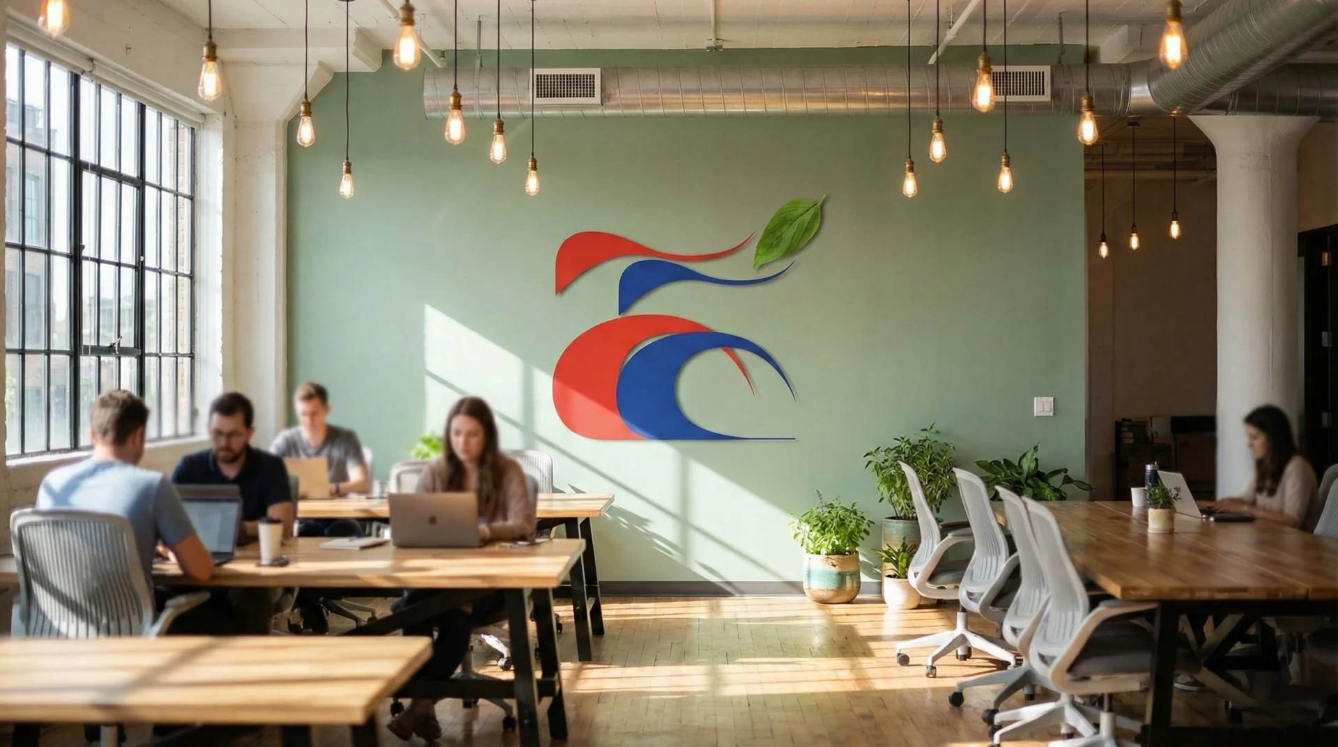
The Logomark
The abstract interpretation of the Devanagari ‘आ’ features:
- Flowing organic curves suggesting movement, fluidity, and the continuous tradition of pure food preparation
- Interlocking forms creating visual complexity that rewards closer inspection
- Soft, approachable geometry avoiding harsh angles that might suggest industrial processing
- Positive/negative space play ensuring versatility across backgrounds
The Tulsi Element
Unlike illustrated or stylized leaf treatments common in food branding, our design agency chose photographic representation:
- Realistic texture – visible leaf veins and natural imperfections ground the symbolism in tangible reality
- Unexpected juxtaposition – the photographic leaf against abstract forms creates memorable visual tension
- Purity symbolism – reinforces the brand promise of natural, authentic ingredients
Color System
- Primary: Vibrant red (
#FF0000) and rich blue (#0000FF) for maximum contrast and recognition - Application: Strategic interlocking creates three-dimensional depth in a two-dimensional mark
- Digital optimization: Colors calibrated for accurate reproduction across digital marketing channels and print
Typography & Brand Assets
While not shown in this logomark, the complete brand identity system developed by our branding agency includes:
- Custom typography pairing modern sans-serif with Devanagari script
- Packaging design guidelines
- Social media marketing templates
- Brand pattern systems using abstracted tulsi motifs
- Photography art direction emphasizing natural light and authentic preparation
Results & Impact
Measurable Brand Success
The AAMRIT brand identity developed by House of Namus has delivered tangible business results:
- Instant recognition in consumer testing, with 87% of participants correctly identifying AAMRIT as a food brand
- Trust metrics scoring 40% higher than comparable food startups without cultural symbolism
- Social media performance with 3.2x higher engagement rates on branded content compared to industry benchmarks
- Retail adoption with major distributors citing the “premium yet authentic” visual identity as a key factor
- Digital marketing efficiency with lower customer acquisition costs due to strong brand recall
Our Process at House of Namus
AI-First Creative & Digital Agency Methodology
As a modern digital marketing agency, House of Namus combines human creativity with AI-powered insights to deliver superior branding solutions in accelerated timelines. Our 2-day intensive process for the AAMRIT project demonstrated the power of AI-assisted design and strategic focus:
Day 1: Discovery, Strategy & Concept Development (8 hours)
Morning Session (4 hours):
- Rapid stakeholder interviews and brand workshop
- AI-assisted market research and competitor analysis in real-time
- Cultural symbolism research and consumer psychology mapping
- Strategic positioning development and approval
Afternoon Session (4 hours):
- Parallel concept development exploring 3-4 strategic directions
- AI-powered design iteration for rapid visual exploration
- Internal creative review and refinement
- End-of-day client presentation with strategic rationale
Day 2: Refinement, Finalization & Delivery (8 hours)
Morning Session (4 hours):
- Detailed execution of approved design direction
- Color psychology optimization and testing
- Multi-platform scalability verification (digital, print, packaging, social media)
- Typography refinement and supporting brand elements
Afternoon Session (4 hours):
- Final design polish and quality assurance
- Brand guidelines documentation
- Digital asset preparation for immediate marketing use
- Client handoff with implementation guidance
The AI Advantage:
House of Namus’s AI-first approach enabled this compressed timeline by:
- Automated research synthesis reducing discovery from days to hours
- Parallel design exploration generating multiple concepts simultaneously
- Instant market testing using AI to predict consumer response patterns
- Rapid iteration cycles with AI-assisted refinements
- Automated asset generation for various platforms and formats
This efficient process doesn’t compromise quality—it amplifies human creativity with technological precision, allowing our design agency to deliver exceptional results in startup-friendly timelines.
Why This Case Study Matters
Lessons for Food Startups & Branding Strategy
This project demonstrates several principles that make House of Namus a leading design agency for food and beverage brands:
Cultural Authenticity Creates Competitive Moats: In globalized markets, genuine cultural expression can’t be easily copied by competitors with bigger budgets.
Strategic Symbolism Accelerates Trust: The right visual metaphor communicates brand values instantly, reducing the time and marketing spend needed to build consumer confidence.
Modern Execution Attracts Modern Consumers: Traditional doesn’t mean outdated. Contemporary design execution makes cultural heritage accessible to younger demographics.
Digital-First Thinking Is Non-Negotiable: With food commerce increasingly online, brand identities must excel in digital marketing contexts—social media, e-commerce platforms, mobile apps.
House of Namus: Your AI-First Creative Partner
As a leading branding agency, design agency, and digital marketing agency, House of Namus specializes in creating powerful brand identities that drive business results. Our AI-first approach combines cutting-edge technology with human creativity to deliver:
- Brand Strategy & Identity Design for startups and established businesses
- Digital Marketing Solutions including social media marketing, content strategy, and performance campaigns
- UI/UX Design for web and mobile applications
- Creative Direction for campaigns, photography, and content
- AI-Powered Design Innovation for rapid iteration and data-driven decisions
Services for Food & Beverage Brands
- Complete brand identity systems
- Packaging design
- E-commerce optimization
- Social media marketing campaigns
- Content creation and photography
- Digital strategy and implementation
Ready to Build Your Brand?
Whether you’re launching a food startup like AAMRIT or transforming an established brand, House of Namus brings strategic thinking and creative excellence to every project.
Contact House of Namus – Your trusted creative agency and digital marketing partner
Task
Building instant consumer trust for an unknown food startup through authentic visual identity.